
More than five years ago, I've been gratefully initiated into the world of brand identity and thenceforth I have grown fond of this creative work. With a slow but enhanced learning curve, I broaden my knowledge and understanding of the process and requirements that represent the ethos of a brand identity. A logo or brand is not just an icon or your name, it’s a bridge between you and your audience. Every brand has its own individuality that wants to be recognised. My role is to simply find the right visual direction.
Role: Logo designer
_____________________________________________________________________________________________________________________________________
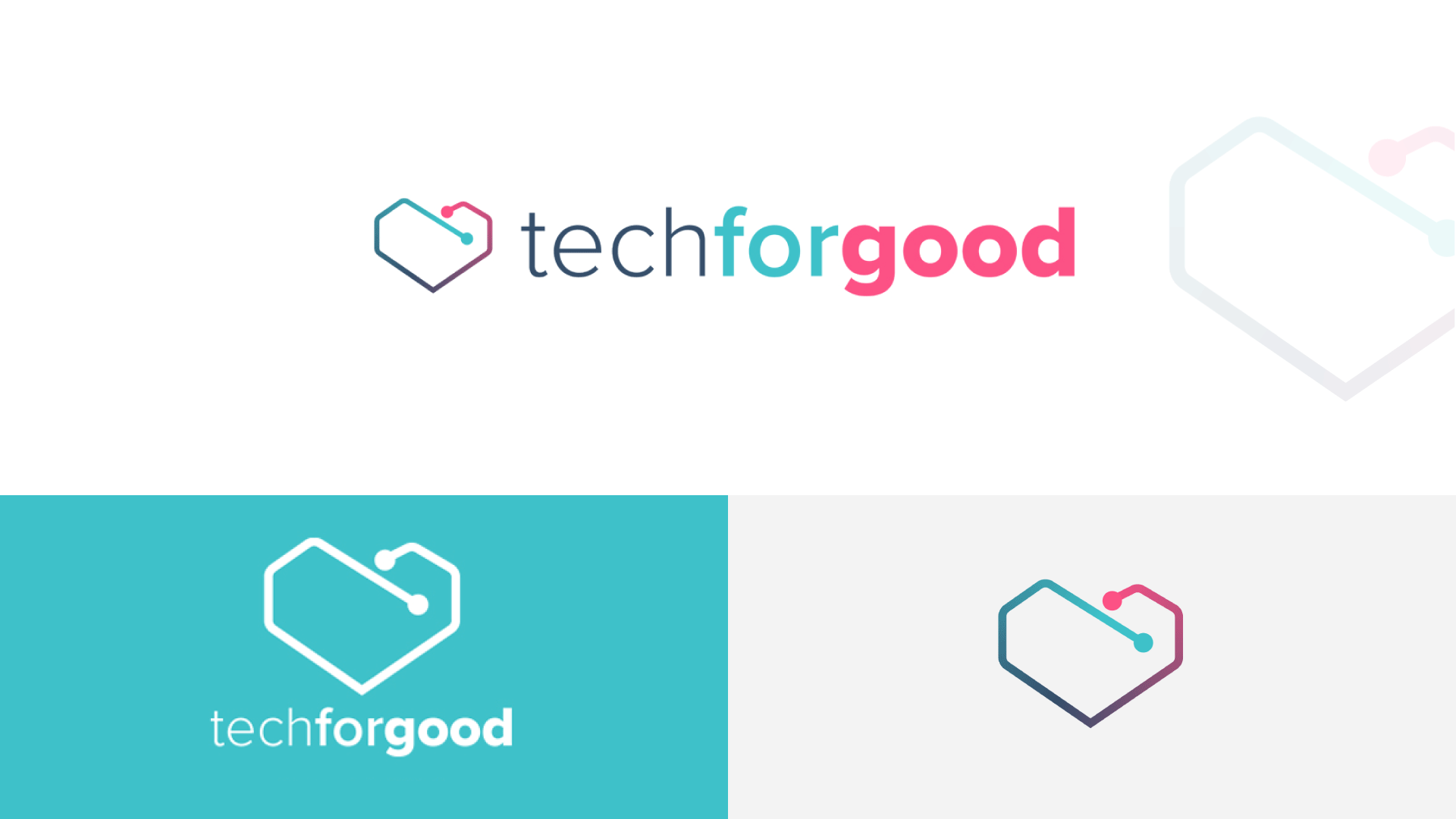
Tech for Good
Tech For good - Looking at technology and digital with a positive social or environmental impact. Combining bold colours with a friendly logo mark, results in a memorable brand identity.
________________________________________________________________________________________________________________________________________________
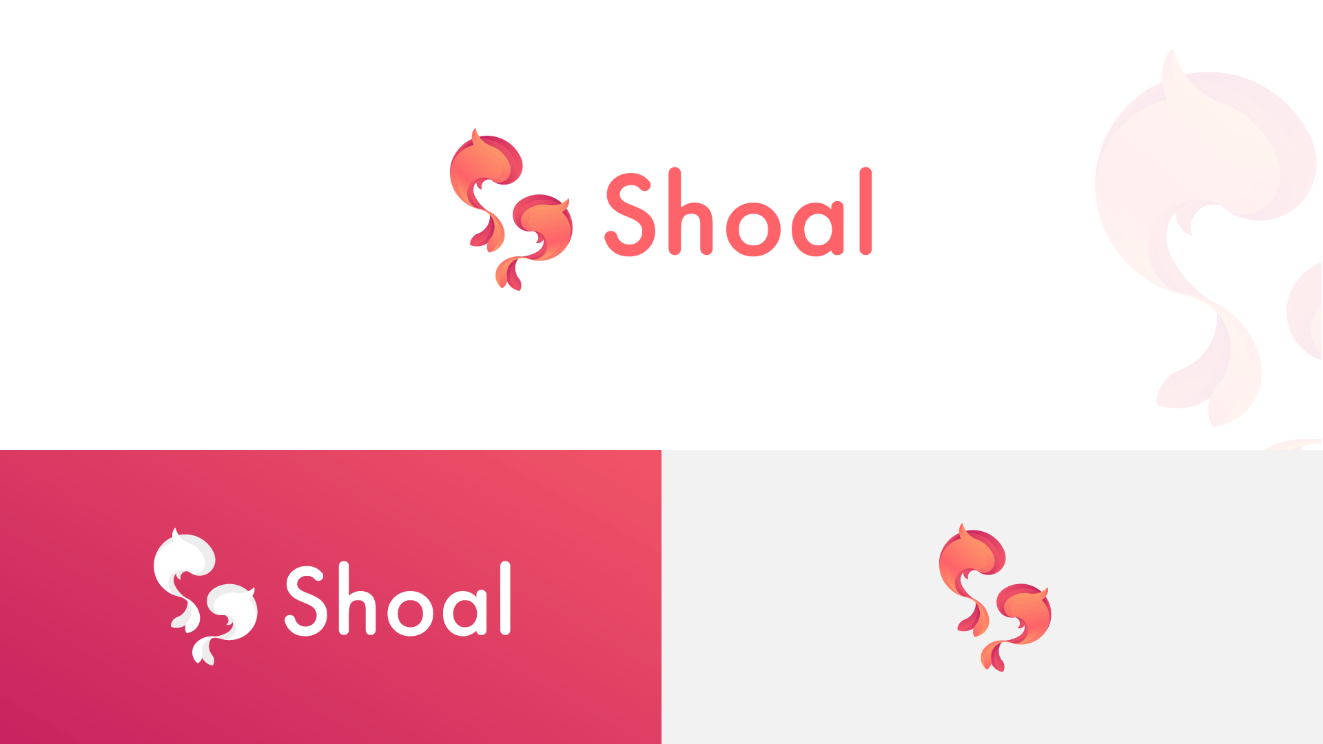
Shoal
Shoal is a platform where various businesses can come together to safely share their knowledge and expertise relating to their field. The idea was to build the letter "S" in the negative space by using the two fish to form a perfect symbol of solidarity and protection.
________________________________________________________________________________________________________________________________________________

Volunteers Week
Volunteers Week is an annual event, that celebrates and recognizes the invaluable and diverse contribution of every volunteer. The star symbolizes the good a volunteer provides to the community. The folding curves also offer the logo character and hints of being vibrant, uplifting and unified.
________________________________________________________________________________________________________________________________________________
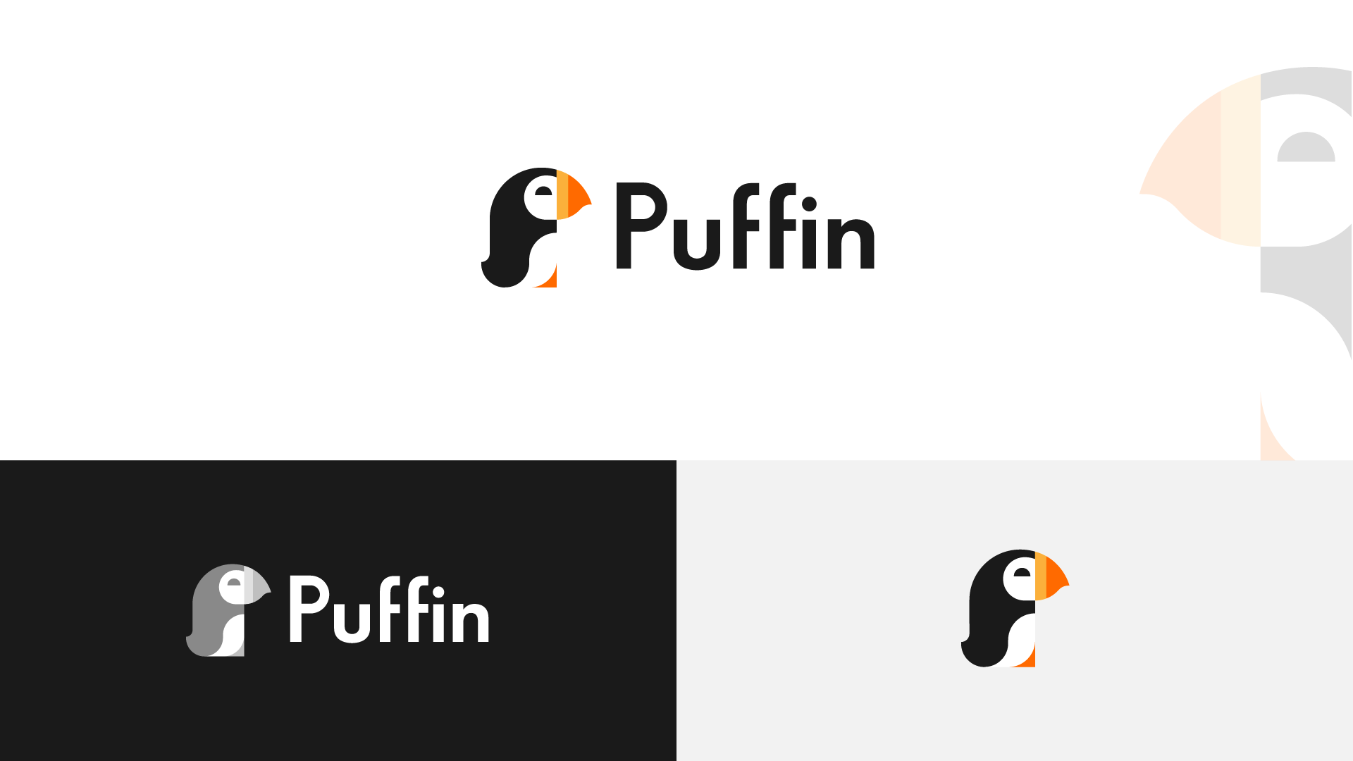
Puffin
Puffin is an online shop that is exclusively selling products to children under 10yrs old. The shape offers a minimalistic yet still friendly approach by using a limited colour pallet and only circles to build the logo mark. It is a versatile logo that can be used on various platforms and sizes.
________________________________________________________________________________________________________________________________________________
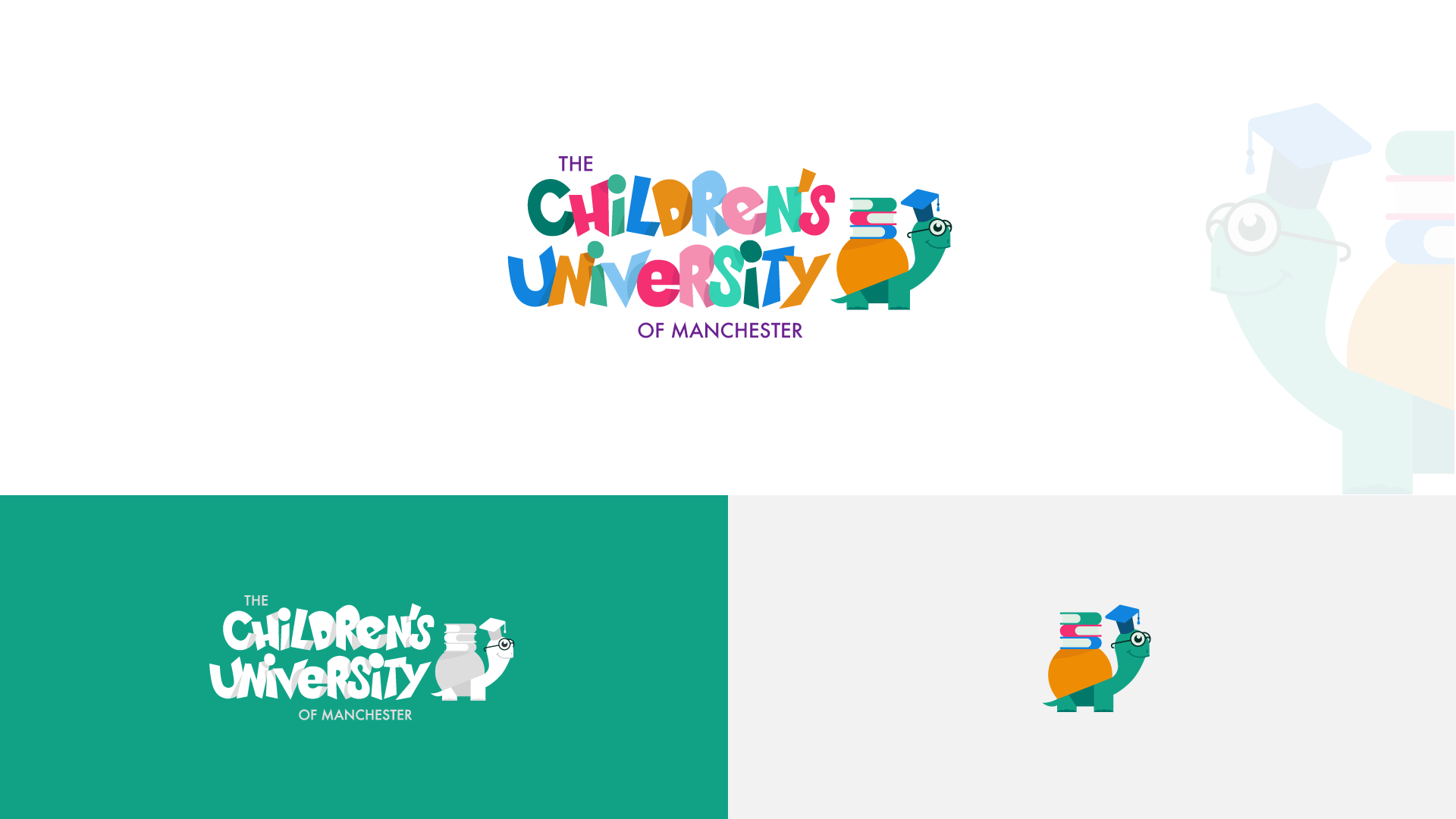
The Children’s University of Manchester
The Children’s University of Manchester provides to the wider community, and particularly primary schools, a sense of excitement and knowledge, created through its pioneering research activities and teaching and learning practices.
The new brand identity offers a fun and welcoming sentiment to the new and existing user base. I tried to achieve this by using a bespoke typeface with joyful, soft and irregular lines, and a gentle colour palette combined with a joyful logo mark.
________________________________________________________________________________________________________________________________________________

Moodboard
Moodboard is a fictional app that uses a keyboard to cleverly interact with the user. Beautiful, accessible and modern brand identity is proudly represented with the eye-catching logo symbol. I've managed to combine a keyboard, a calendar and a smiley face in a single mark.
________________________________________________________________________________________________________________________________________________
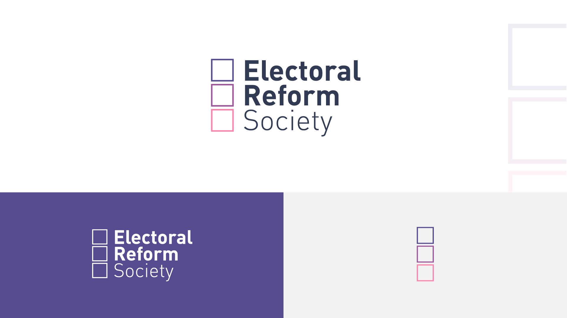
The Electoral Reform Society
The Electoral Reform Society is an independent campaigning organisation working to champion the rights of voters and build a better democracy in Great Britain and Northern Ireland.
Whilst the existing brand is well established in political circles, this new design maintains the attributes while at the same time improving brand awareness and recognition. The reversal of the downward fade is used in order to guide the viewer and to improve the reading flow. The bolder use of colour and a daring colour scheme also helps the Electoral Reform Society logo stand out in a crowded space.
________________________________________________________________________________________________________________________________________________

AtmoScan
AtmoScan is a full-service platform that aims to offer accurate atmospheric readings. The logo is a “combination mark”; comprised of a logotype and a symbol. The two pilours of the symbol are, the "cloud" and the "magnifying glass". All of these graphics are overlayed providing a delicate balance between professionalism and friendliness.
________________________________________________________________________________________________________________________________________________
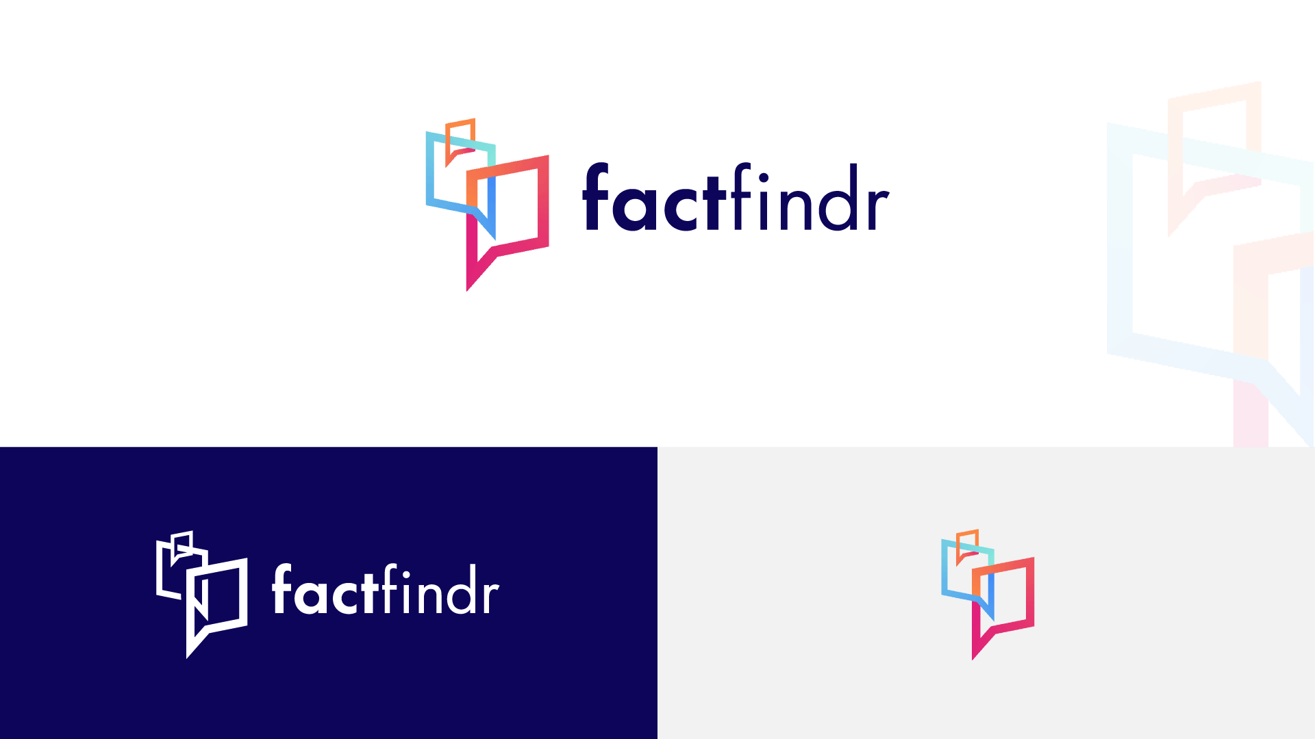
factfindr
factfindr is expert advice and information, for young people, on all aspects created and amplified by digital technology.
The logo strikes a delicate balance between professionalism and friendliness. The symbol is intended to represent the many facets of factfindr. The use of a dialogue box is meant to uncover the idea of advice and information sharing; whilst the upwards placement offers a sense of pioneering and discovery.